How to get better at pixel art
How to get better at pixel art
Hello guys I want to get better at pixel art where do I start? I mean I am not really good, I made 2-6 projects that I am proud of the others are eh....., Not so good and the more I dig deeper the harder it gets and the more complicated patterns that I see I can copy a dude making a pixel art with only shading so 1/8 of his art is in darker color the others are bright and thus creating the illusion of shade but the more I dig the harder it gets
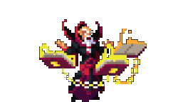
If we look at the first wizard we can see that his pixels are colored differently not only for the shade part if we dig deeper to his face his face is all colord with weird colors although when I look at the image as a whole he looks even more real than coloring his face with only 2 shades of pixels
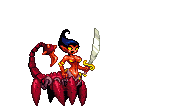
if we look at the scorpion lady we will find the same pattern with her using 4 different shades for the legs + a whiteish color and her whole animation looks very smoth with over 20 animations her art is amazing and truely not my next level to learn but I thought I would bring it up
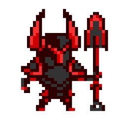
If we look at the third image the red knight is amazing, He is simpler but the coloring really makes a difference if we were to remove the coloring and use only 2 shades he will look funny not only that he has a cartoony look his head and body are really big while his hand and legs are really small, Although we when I first looked at him he look really normal to me not noticing the huge difference in size
Bottom line is coloring makes alot of a pixel art and choosing these random colors and putting them in random spots makes the sprite look less funny less cartoony and more real so how can I Imporve my coloring and my pixel arts techniques as a whole?


It would be helpful if you show some of your works that you doesn't feel satisfied with so that the artists here can see at what area your works could be improved.
Sure some of these might look weird in terms of their shape but it's because I want them that way, Sometimes the simpler they are the better they will look like my wizard/knight and spider scorpion king is kind of a high level art for me he mises alot of "Stuff" I think there is alot of work to be done with him I dunno what to do esp. with the animation I made idle and walk animation but the attack animation is hard to do cuz I have to animate the tail each time I animate the tail it just goes really really really really really really really bad
Sorry about the bad scorpion attack with the extra tails in the mix but I was just editing them then I dropped them here something is missing with all the scorpion kings even in his normal non-moving image, Something is missing he doesn't look top notch as for the spider as well some of these "Colorings" is needed but I don't know what to do to make him better the knight as well looks so quirky so I can't do anything any help highly appertiated ty
I'm not an expert here and others, hopefuly, could contribute more, but the colors is not the only issue with these figures. There is a far more deeper problem.
You really need to consider the form. The shapes and silhouette. It should be readable. For example, the first wizard has a strong and recognizable silhouette. Yours however has a very unclear silhouerte.
This might also be because of how small your image is. Just 20X19. There isn't enough pixels to work with.
Most importantly, the forms should be correct... that is study the actual anatomy of what you are trying to draw.
The wrong forms/anatomy is really clear with the spider. The legs of the spider is attached beneath the spider's head. The eyes are arranged in various ways but ussually a spider has two large eyes in the front and smaller eyes around them. I make a quick drawing to show how the parts of the spider are attached together. Though... my drawing seems to make the spider a little on the chibbi side.
This is great advice, and very useful! I never would have thought about it that way (focusing on the shape and shilloutte). That makes a ton of sense. So, then, should one start with an outline or lineart and then go from there? (I'm totally new to the pixel art world.)
Overall, I love the first pixel art creations you made! I think the others that you posted later are a bit too small to get a proper view of.
Well, I'm new to making pixel art too, but my usual way of drawing starts by shaping the form. I usually draw cylinders and boxes and spheres to form the basic form of what I'm drawing.
Sometimes I actually just draw a silhouette. Say a very sexy lady, I'll first draw an hourglass figure of the torso and hips and then I add the limbs and head to coordinate with the hourglass figure.
Other more experienced artist might have a better way though. I hope they will enlighten us!
Thank you for replying and sharing your information but your spider isn't considered pixel art and pixel art is characterized by having a low pixel count 8x8, 16x16, 32x32, 64x64 and 96x96 those the most popular amoung pixel artist some peple go for 128x128, I have never seen anything go higher than that and ofc the silhouette shouldn't always give the exact idea on what the thing is thats how pixel art do I mean the sprite below shows my point if we look at the last 2 characters and paint them black and remove the weapons we wouldn't know who is the archer who is the wizard also the orcs and knights silhouette are really simillar if we paint them all black we wouldn't know also if we look at the bottom right he has a spider creature which has only 4 legs and the legs are coming out of the body because... pixel art thats how pixel art moves no need for 64x64 sometimes the most simple pixel arts can make alot of money and I have alot of examples of 8x8 pixel art games making over 7k+ or 10k+, If I understood your comment the wrong way please correct me I am just a newbie :p
Kata and ralmonM thank you for your comments, Kata the first characters are not mine :p I didn't draw them thats why they look good :P, I want my 2nd patch of images to be good and these are my drawings, RalmonM I will try your idea I usually go for the coloring first but now I will try to do the basic figure/shape then put the colors on maybe I will get better XD
Well... I said the spider was a drawing, not pixel art! I was draw that to show how the parts of the spider go together. And even then, my drawing is only 200x100 or 100x100 per spider.
And actually, the sprites you showed me shows good silhouettes.
Also, form doesn't mean what creatures they are. Humanoid form, female form, tall, short, round. Turn these sprites to silhouettes and you can still identify their form.
And as you requested, silhouette version.
Though, some creatures does suffer, like the spider, which makes it looks more like a mite. The dog's form, however, is really well depicted, which I really find amazing.
As for the spider. It's the limitation. The sprite is only 8 pixels wide. Yours however is not. Yours is 37 pixels wide. You could have make it more realistic and detailed.
As for colors... they aren't going to help much if the form is not done well, and I think the problem with your sprites is more of the form than coloring.
I actually think your art is great! I'd be proud of that work! The best thing is practice and finding inspiration. It's a point I'm currently at. I need a lot more practice than you :P
Hiya all, Im new to game making & game art. I also choose pixel art for my game as i know paint like the back of my hand. :) yes i use paint, trying to learn gimp but it does strage things for me
I have watched tutorials and guides on you tube, tips and tricks etc.
I do think the key point is to get inspiration, then just go for it and mess around and practice till you are happy and become more comfortable with it.
I been trying to build my game for 2 years, last 8 months or so drawing art for it as well, this site is good for lots of different assets and the comunity is great
So if you click my name you can see what i have drawn by all means not masterpeices but i happy with them for now, they basic and look like what they are supposed to. As my buildings will be upgradable, im gunna use what i got for lvl 1 buildings then redo add some more detail if i can then that be lvl 2 and so on till i hit lvl 5.
I have ditched lots of peices i have done as just didnt like em, it all pratice practice and be creative.
also colour palette has lots to do with it as well, i think the one alot of people use is db32.
my best regards
Ninja Dog
@La3eb
I like your Knight a lot! It's probably the best work you've showcased here imo. The spider is pretty bad to be honest.
@La3eb: Ah, I see. Still, I think it's great that you're making things and getting feedback! There are some good Pixel Art tutorials on Udemy by Benjamin Anderson. I found them really easy to understand and super useful. He uses free software, too. There's a sale, so you can get the $50 course for $10.
@RalmonM: Thanks for the tips! I love hearing about how other artists go about creating their work. Everyone is a bit different.
@katastrophic what are these courses? They must be a really niche market.
@Kir Anderson makes different courses about game dev, and he does one for pixel art on Udemy. I can't post a link, but you can Google it and find it. Udemy also has some other pixel art courses on there, too.