Need talented pixel-artist for my turn-based strategy game [Sci-Fi]
Need talented pixel-artist for my turn-based strategy game [Sci-Fi]
Hello everyone!
I'm new, so I would like to introduce myself real quick.
I'm MadByte, hobby game developer, 27 years old from Germany.
Please excuse my somewhat broken english!
What is it all about?
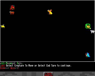
I'm currently working on a full GDD and prototype for a new minimalistic 2D turn-based tile-based strategy sci-fi game. It's an homage to an older game I used to play when I was young called "Chaos". It released as a Public Domain game on the Commodore Amiga. Here's a screenshot of this beauty:
What do I need?
I need an pixel-artist who creates futuristic units / buildings in a slightly angled top down view. All sprites need to fit on tiles (32px) but can vary in height a bit (as seen in the example designs below).
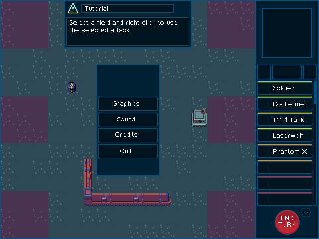
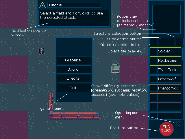
To get a better idea of what I would like to archive, I created a game screen design on my own (I like to draw some simple pixel art as well) which visualizes the main game screen. The shown tiles are from OpenGameArt.org, they kinda represent the artistic direction I want to go with the game.


I'm currently fleshing out the design document and hope to find an collaborator early on for this project. If you are interested, please post a reply or send me a PM. I also would love to answer further questions if their are any.
Thanks for reading!


I might be able to help you, if all you need are some 32x32 icons. ^^
You may want to check out Buch's colony sim assets, and rubberduck's extension.
@Spring Thanks for you offer! 32px icons is not all I need. The units need to be animated later on, so this should be considered when creating them. Their are also some other sprites I need like the buttons, effects for damage, movement etc. Would be awesome if I can find someone who wants to contribute more then just the units, but they can be a good starting point.
@DezrasDragons
Thanks for the links. The set is really nice, some buildings seem to work fine for my needs. I'll use them as placeholders for now. I updated my mock up to give a more distinct impression of what I want to archive.
Well, it's no problem for me to make some animations either really ^^
What will be a problem though, is drawing stuff which fits well together with that colony sim tileset.
@Spring The placeholder tiles are nothing more then this - placeholders. I think they look nice and they represent the direction I want to go with new visuals. If you're capable to create a new, similar art style, then I'd love to see more :)
Well, I can try and make an example drawing, and then you can choose what style you like best.
Is there anyhting specific you would want for this?
@Spring nothing specific. You could draw a unit (Tank, something flying, soldier), new walls, buildings or something completely different as long as it fits into the setting and overall look and feel. :)
Thanks for doing that.
Here's an attempt at a soldier, but there are some things which I've done differently than the tileset creator.
@Spring, okay I got a bit too much inspired by your soldier, thanks for the mockup :) I experimented with different art styles for those types of units.
I like the idea of your sprite (1) [I removed the colored stuff to make it more clear looking for testing], but my first thought was that it somewhat lacked detail. It blurred out to the legs and I thought it looked to busy, not as minimalistic as I think it needs to be.
So I began to add some detail to the same sprite (2), and I think it has improved quite a bit.
But I still wasn't sure if the size is good as it is, so I tried to make it a bit bigger (3), but I'm not happy how it turned out.
Another option was to go even more minimalistic and just make a bunch tiny pixel-soldiers all on a single tile. I think they look kinda cute and matching to the simple design of the placeholder buildings but they also are very undetailed and maybe too small. Now I really don't know what I want to do, also in regard to all other units like tanks, spacefighters. Should they look ridiculously big compared to the buildings and soldiers? Should they be similar to the tiny example soldiers? Should everything be a lot bigger?
Also, this art style could be entirely wrong and maybe just needs another talented pixel-artist to look good.
I'd be happy for any suggestions and examples ...
I think of your attempts, 4 looks the best by far, and proves that you're a good pixel artist in your own right. All the other ones look pretty bad, so I think you should definitely go for 4!
Thanks!
Maybe you're right and the "small soldiers idea" isn't that bad. But I still think other units should be way bigger.
Another option would be to change the tile size from 32x32 to 64x64. That way there would be more room for small, but more detailed sprites. Anyway, thanks for your help.