Seeking comments on pixel art I'm making for a tutorial
Seeking comments on pixel art I'm making for a tutorial
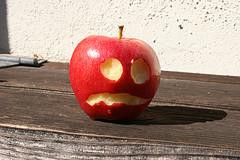
So, I was trying to do a pixel drawing using this reference here:
https://www.flickr.com/photos/kellinahandbasket/1511227496/in/set-721576... (Provided for reference below, image CC-BY 2.0 by kellinahandbasket, see link for details).
I want to show an example of how to use area shading in order to depict volume. I've attached my two attempts at it. I think the second one is probably the better representation. although it forced me to sacricife one shade on the apple, making it a bit darker than I wanted (I was limiting myself to a total of 4 shades of grey, plus transparency). However, when I used a lighter shade, I didn't have enough available colors to show that the eyes and mouth are lighter than the rest of the apple.
Anyway, I'm looking for comments, so as not to lead people astray in my tutorial. Ultimately I'll probably end up showing all of my attempts, because there's some value in pointing out the mistakes and missteps I'm making as I go.


You've selected a sophisticated example illustrate. I'd like to disassemble your example a bit in order to understand if it is meeting your tutorial requirement.
It's sophisticated because the shadow falls across only one "eye" which means that the inner flesh of the apple needs to be rendered in two different tonal values, one for the eye that is lit and one for the eye in shadow. Nothing wrong with this as an example, and you've handled it well in "apple2.png". But without the context of the actual tutorial, I want to make sure that this complex of an example is exactly what you need because a simple sphere would easier to define.
Ignoring all of that and addressing what you've presented: you've applied the tones well, but here are some tips that will increase the perception of spherical volume ...
The apple as you have rendered it is more heart-shaped compared to the photo's more circular profile. Rounding the apple more will signal to the viewer that they are seeing a spherical object.
The shadow falling across the face of the apple is an S curve. On an idealize sphere the shadow will be eliptical. Because you are dealing with such a minimalist image the subtilties of the curve are undermining the base spherical form.
The highlight and the eye represent different aspects of the surface of the apple, but they are the same value which confuses the volumetric space that the apple represents. Because you are dealing with restricted pallette it will be hard to define tones that will separate enough to represent these to aspects. I believe that the highlight should be a darker tone than the eye, for this reason: the eye represents a break in the surface of the apple and the highlight represent the surface of the apple. The highlight should be closer in tone to the "lit" surface of the apple so that appears to be contiguous. The eye is not part of the contiguous surface and will hold up being higher contrast.
You might play around with the ratio of lit surface to shadowed surface. Currently its about 50/50 which makes it harder for the brain to decide what the spacial relationships are.
"Dammit Jim, I'm an artist, not a software engineer."