Armor inventory graphic, looking for C+C
Armor inventory graphic, looking for C+C
Monday, December 24, 2012 - 22:23
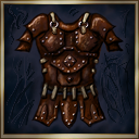
First go at a leather armor graphic, of the sort that might be used for a WRPG inventory. Doesn't seem quite right to me yet, maybe the shading or coloring. Any other C+C welcome too.


Looks too flat, and tries to cramp too many details into the relative low resolution. Also loose the messy background, it just distracts. Good start though.
Overall I would say there is also a bit of "confusion" in regards to what style it is supposed to be. For pixel like art it is too paintery, for paintery it is too detailed, and for realistic style it is to "messy/paintery" and also too flat (I would probably paint over a quick 3D sketch to achive more depth, and also rotate it differently).
--
http://freegamedev.net