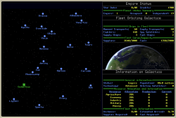
What style buttons would you use with this UI?
What style buttons would you use with this UI?
I'm recreating a classic (old!) Mac game called Galactic Empire. But I'm making a few tweaks to the UI as I go. Currently it looks like this:

In those blank areas below "Fleet Orbiting Galactica" and "Information on Galactica", there will be little icon-based command buttons. The original game used gray, 3D-ish bevel buttons. It's nice and obvious that those are clickable, but I feel like that doesn't really match the style.
So. What kind of buttons would you suggest to go with this UI?


Mouse over color changing words might be good. Lerp the size of the text slightly bigger and then back when the pointer exits as a highlight. Maybe a slight glow?
Or, a horizontally scrollable set of words and whatver is center is the "button" that happens. Almost like words wrapping around a planet but the center word is focused. Then you can click and drag to the menu you want.
The overall look of the UI is great. Very simple and easy to understand.
Keep up the good work!
I agree that some kind of hovering animations or effects helps and makes the gui feel responsive. Nice and cool project!
Thanks guys! I'll run with that and see what I can come up with.
Just to follow up, here's what I've got going now -- flat buttons, arranged in a strip with rounded corners on the ends, and a subtle mouse-over highlight.
I'll probably continue to play with the exact colors, but I'm digging the general effect. Thanks everyone for your ideas!
Very nice! The purple is a good color and it breaks up the different menus very clearly! Good job!
I like it! the colors do not only look nice but it also help differentiate the different sections. Well done!
i thought more of a neon-styled buttons (every button separated, black background, no rounded corners, and neon border on every button, that style)
sort of that i meant (yep, for the now was doing it in paint):
Hmm, that's not bad. I'll give it some thought.
Meanwhile, if anybody wants to follow the project, the github is here: https://github.com/JoeStrout/galactic-empire/