Newbie question on pixel style
Newbie question on pixel style
I am currently developing a game and was trying to figure out art style and I am getting really confused. I am not a designer but a developer and going to be using some designers to help.
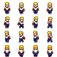
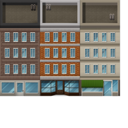
I was looking at some of the paid tile art and was going to use them sparingly and keep to a certain style but I was told my characters don't line up with the style of art. Attached is a copy of the tile art and a copy of one of my characters. Can anyone explain why they dont match, and what I would need to do to make them match?
Does my character not have enough detail? Can anyone point me to a tile art asset that may be a better style than this one? Not that I am going to pay or use it but I need something to understand and explain to the designers.


Difficult question to answer, but one of the large discrepancies between the buildings and the guy, is that he has a black outline all over, whereas the buildings do not have this at all.
An example on how to maybe change that. If you want to.
[NOTE: This user has been deactivated for repeatedly using copyright-infringing works incorporated into artwork. Assets from this user may not be legally usable in your project. Discretion is advised.]
So I would need more detail and remove black lines?
http://www.pixelcitybros.com
I think you should remake the tiles, actually. Use the same color palette for the tiles that you used for the fighter.
Or Bobby