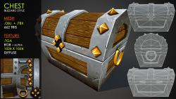
Chest Blizzard style
Chest Blizzard style
Sunday, October 21, 2012 - 07:52
Art Type:
License(s):
Collections:
Favorites:
81
Youtube : http://www.youtube.com/watch?v=xN-WQvdSsrQ
EDIT: mixed the 2 previous textures into a new one + added a video preview
File(s):


Comments
why the white outline around the cuts in the chest? Would probably look better without them.
Nice one, although I prefer the realistic style you did before ;)
If I was to nitpic I would say the mirrored wood at the front of the lid (e.g. the part that is most visible) is a bit too obvious, especially due to the circular part.
Like it!
great!
I like this chest alot. I dont quit understand the design of the lock but i spose it could be some kind of special key. the handles on the sides are a nice touch.
Oh, i like the way you unwrapped it. Did you paint it yourself?
Great model, even though its not my style :)
One thing - I loaded this model into my engine and noticed some problems with the light on one side of the chest and on its back. After turning on normal visualisation and checking the model in Blender it seems that you didn't merge vertices on one side and back of the chest (they don't share normal but have normals of their own pointing in opposite directions, unlike correct side and front of the chest).
They create sort of T-junction which shows artifacts + breaks lighting, worth correcting by merging these vertices together.
if it works okay in OBJ then ignore my comment - I imported this file into Blender, so there is always a chance that the process broke it.
Of course I did =)
The process sucked somewhere, the fbx & obj are fine I checked them right now. No bug. =/
Yeah I thought so too, I could hardly believe I found something weird in model made by you (btw, incredible work there man!)
Ehh, this means something is quite wrong with Blender import of OBJs, because the problem was already visible in Blender, even before I exported to IQM.
Sorry for trouble :)
I like the hand-painted style a-lot. i think you should make some more models in this style.
fine work. very useful
Very Nice!!
The mtl file is missing. I fixed it but can't send here as attachment.
Nicely done!