[LPC] Improved animations for axe, pickaxe, warhammer, etc.
[LPC] Improved animations for axe, pickaxe, warhammer, etc.
Hi,
I am trying to improve the current animations for axe, pickaxe, warhammer, and other weapons/tools that needs a movement from top to bottom.
I started from the idea of the current axe animation: reusing the frames of the slash animation but playing them in reverse order for certain directions.
Here are the orders I used:
* character facing north: 5, 6, 4, 3, 2, 1
* character facing east/west: 6, 5, 4, 3, 2, 1
* character facing south: 1, 2, 3, 4, 5, 6
I wrote a script to generate this "smash" animation from only three images: a horizontal side view, a side view with an angle of 45° and a rear view.
I also made new pieces of art:
* cleaner rotations for the axe, the pickaxe and the warhammer
* rear views for the pickaxe and the warhammer
* rotation and rear view for the labrys included in Reemax submission
* side view, the rotation and rear view for a new hammer (I will shorten the handle, I think)
I still have to generate the walk cycle and to adapt it for female characters.
Let me know what you think of this first version! :)

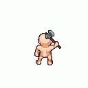
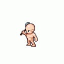
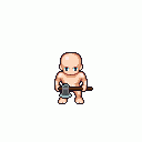


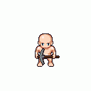
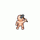
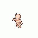
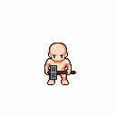
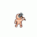

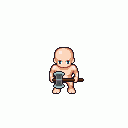

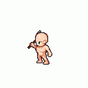
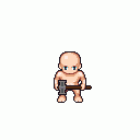
The north and east/west are pretty good, though the east/west feels a little jerky. A motion blur/smearing effect would smooth that out.
For a top to bottom smash/chop attack, I think the south animation needs to be completely redrawn. I was going to give some recommendations on how to draw it, but then I got carried away experimenting and made one myself.
This is pretty rough still, and I haven't tried it with a weapon, but it is probably useable. There are only two new frames (and only the arm position is really new), so it shouldn't be a lot of effort to make clothing fit.
I think this would be better as a two-handed attack, but that would require re-drawing the other directions, and I don't have time right now.
Very neat stuff, and impressive effort with minimal modifications.
I agree with BenCreating that the south-facing "chop" animation probably will not really look right unless re-drawn. That may or may not be a problem for the gameplay you have in mind. For instance, I think the south-facing axe and pickaxe animations look fine and could still be used to crop trees/smash rocks, even though in the east/west-facing directions the character is starting with the tool/weapon higher over their head and swinging down. If I were making this game, I would favor using the existing base sprite animation and settling for a slightly different south-facing animation (as pvigier has done), since re-drawing the "chop" animation would require that any clothing or other sprites also be re-drawn. Even at 2 frames each, that's a lot of work :p
I think the issue is that the east/west-facing animations really need some motion blur and some 3D perspective. For example, if the character is chopping a tree, the axe should start in the same plane as the character, but by the middle of the animation, with the arm outstretched, the axe head should be parallel to the ground. This can't really be achieved just by rotating the sprite in 2D. Of course, if they are splitting logs, the animation should be more like what you have, but motion blur would still help. I think the only real solution is to re-draw the animation, which will produce a much nicer result.
Same applies to the north-facing animations. There seems to be a small error where the second-highest frame is drawn layered on top of the character's head, but that doesn't really make sense with the way the item is being swung.
For the walk-cycles, you can definitely get away with just rotating the sprite and some cropping. But I would suggest using the walk cycles from my extended weapon animations or BenCreating's medieval weapons as a base to determine the right angle of rotation. The walking animations in DarkwallLKE's original sprites don't really look right to me at all :p
Hey, sorry for the late response, I was working on other things.
The south facing animation is definitively weird but I made several experiments and that is the best I could do with existing frames. But when players will use the south facing animation when chopping/mining, they will be partially hidden by a tree/ore vein so that mitigates a little the issue.
Yeah, the goal of this animation was to not add new frames to the base character to not have to work on clothing. But as there is discussion to add new frames to the base animation on the other topic, maybe it will be useful for these weapons. By the way, BenCreating, I am not sure to see how the weapon should be placed on your proposed animation.
In general, I am not fond of of motion blur, but I agree with you that in this case, it could make the animation smoother. I have no experience with motion blur so it is maybe beyond my skills and I think it should be different for each weapon so I am a bit reluctant to start working on this.
I reworked a bit the west/east animation (just changed the hand position). I made the walk cycles (added 3 new rotations for that). And I made the female versions. For now, only the axe and the pickaxe are ready but I will finish the other weapons too.
I think the animations are not perfect but already usable and it is a large improvement comparing to the old ones. I think I will use these versions in my game. I will look how things go on the other topic: if a new animation for the base character is done for smash/chop, I will surely revisit this. If not, I think I will commission improvements.
Do you think I should make a submission for these animations at this state or I wait the definitive version?
EDIT: Is anyone interested in the script I used to generate the animation?
EDIT2:
Oops, I just realize I put the weapon in the wrong hand for the west/east walk cycle. I will fix that.Fixed!I like them. The others have some valid points, but I think that has more to do with the nature of the medium than anything else: meaning, there's only so much you can do within the LPC template.
It's a big improvement, for sure! I still think the motion blur is necessary for the chop animations---you're just trying to convey dramatic movement in very few frames, so without motion blur, the animation will always look pretty choppy---like a game running at low FPS. You're right it will need to be different for each weapon, but it's not that hard. I'd be happy to give it a try if you'd like. Castelonia was also interested in this.
Yes! Submit early, submit often! You can always update, and use the Bump Requests thread to move the submission back to the homepage if you make a major improvement. Definitely upload the script(s) too if you can.