bold boxy fat font
bold boxy fat font

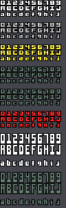
I took Clint and usr_share's font, made it one pixel wider and added an extra row to the bottoms of the characters to give it a 'fat bottom' look.
I also hand stretched the font 2x in height to create a 'tall' variant.
Finally, I added a base and tip to the 1, mostly to make all the numbers monospaced, but also because I just like 1's that way. :)
Dimensions should generally be 8x8, and 8x16 for the tall version, although a few characters (M, W, ...) are 9 pixels wide, and some are only 7 pixels wide (most of the lower case letters).
Also included for good measure are several fill styles I created in various colors. They are:
'gradient' - a smooth gradient I created using GIMP 'Cool Metal' filter
'edged' - a simple edge treatment I created by hand
'aa' - an attempt to give the font a more 'rounded' look via hand drawn anti-aliasing
(don't think this came out all too well, but including anyway)
Comments
Fat-bottom fonts you make the rockin' world go round!
Neat stuff. Let me know if you (anyone) want to make this into a true type font like I did with the base:
http://opengameart.org/content/boxy-bold-truetype-font
Would be really great if someone makes a truetype font out of this ;)
oh dear, looks like the A on the plain tall variant is missing a row of pixels, please let me fix before you spend anytime making it true time :)
Nice !!
thanks! you remind me, I need to double check about that missing row of pixels, I can't recall if I ever uploaded a fixed version or not. :)
Neat. I like the dark metal variety, reminds me of old DOS games.