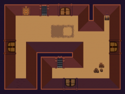
Cute dungeon LPC edit
Cute dungeon LPC edit
Modified from http://opengameart.org/content/a-cute-dungeon. This is an enlarged version of Buch's original dungeon set, for use with other LPC assets (the smaller-sized version looks odd with the large LPC base sprites). Doors and door frames need two tiles+transition rather than the single tile in the original, which ends up taking quite a bit of space (compare the preview with the original, I tried to build a similar map using a similar amount of tiles) and the weirdness of the perspective stands out more in this way. I have seen other sets use pillars in the corners to hide/soften some of the weirdness but I haven't done that here. I'm working on an alternative that exchanges the height for extra width on the vertical sprites (you don't really need the extra height compared to the LPC base sprites there) which may also help with some of the perspective weirdness. If that works out I'll get back on that.


Comments
Nice !!
I was editing the doors to make them look leaned in instead of flat. The pixelation was a bit annoying, but I'm also very new at this.
I'm still trying to figure out how to get these to work with the tiled map editor where I can use the terrain brush instead of building these one tile at a time. That's been a challenge because I've sorted the tiles to 32x32 and the walls are MUCH taller than that.
And so it goes.