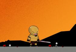
Review my art. What do you think?
Review my art. What do you think?
Hi everyone,
Ill straight jump into the topic. I've attached an Image of a character and I would like if you could give me some comments and review it. I really need some reviews :D
Now a little more details. I want to create a whole bundle of gladiator characters(hero and lots of enemys including 1 boss) + arena + gui. So this is a huge work for me. And in the image you see the main hero ive drawn so far.
- I want him look like a warrior.
- I want him not to be too heroic like rescuing people, doing good etc. Instead I want him to look even a little bit evil.
- He should be aggressive and driven by vengeance
One more thing. My basic idea was to start with no items and as you gain more power and rise in levels you can equip new items. Thats the reason he is so "nude" at the moment. Because thats his basic look. But later will have armor everywhere. So thats it! What do you think about my art and also the idea itself I explained a little bit. I know it's nothing new, but will be a great bundle. Last word: If I'm heading the right direction and I ever finish this MASSIVE WORK I'll give a free copy of it to anyone who commented and is interested. yo ladies(are there any? :D) and gentleman thanks.


The idea is good and is classic which always attracts players .
I think maybe a monk needs Kongfus or sprite enchantments,not equipments.:)
Definitely got a Kratos from GOW vibe to him, but that does match the feeling you are going for (eg. anti-Hero, driven by rage).
No digits on his hands? Is that intentional? TBH it looked a little like his free hand was missing (chopped off).
The highlight on top of his head is a little shiny, gives him a bit of a plasticy look. Like a bubble or a bobble-head toy. But on the other hand it does soften him a bit, adds to the cartoony charm so maybe it's what you want.
Well those are just my two cents, good luck with the project!
https://withthelove.itch.io/
Thanks for your comments. Helped me to improve him alot.
@capbros ya it was intentional with the hands, but I already changed it.
Sorry for the late reply I was busy drawing :D
He reminds me of Attila the Hun more than a monk or humble warrior. For that look, I think he could use some armor, and more hair. A ponytail on top or maybe a larger beard that isn't trimmed (all the way up to the ears) would look good. How about giving him some scars?
Thanks. You know whats awesome? I made a pony tail before you said it. :D
But good to know that someone else felt like me .. Good point about beard, should I make scars into his face? It's like every xy hero in games and movies has a scar on his face. By the way I actually draw scars on his body, but made it opaque. So should increase the depth maybe to make it more "seen".
Also if anyone has a name suggestion how to call him would be nice. Ill make some title text with that name.
I think of Barbaros like Barbar + os . Or maybe Atilla, can also be some describing name like "Angry man" or "The Gladiator" etc.
I was drawing him when suddenly this question came in my mind. What if i change his skin color? I pick up famous characters which have uncommon skin color. Im usually the guy who picks the normal stuff but other colors dont look too bad either..What you think? any thoughts?
pony tail looks great. so do the eye variants
recommend putting both in layers for mixing/matching or to use as distinct objects. that way you can give your players some basic customization options. It's a little more work on your end but really enhances the end-user experience (imho).
This is the final art.
Thanks guys for your review comments.
There is always place to improve. But it's fine enough for now. I did 10 animations for the start.
Once I clean up the project, ill share a link with you guys so you can download it fore free as promised.
I always make some evolution to see if the art really improved. Just interesting sometimes to see it..
Fine enough? He looks AWESOME!! Great work and good luck with the game, be sure to keep us updated on it!
https://withthelove.itch.io/
...what @capbros said. Doesn't need any more tweaking
It's fine, looks much better that what I am using for my game.