Gradient (Blend Sky): Bad for 3D Model's Backgrounds
Gradient (Blend Sky): Bad for 3D Model's Backgrounds
I have zero 3d model-making skills but I do moderate content on OpenGameArt.org contributions and stalk Blendswap submissions, which allowed me to notice the following: Gradients are bad for previews. Just take a look:
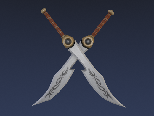
Above is a png (lossless, 173K) render with gradient ("blend sky" in Blender terms) background.
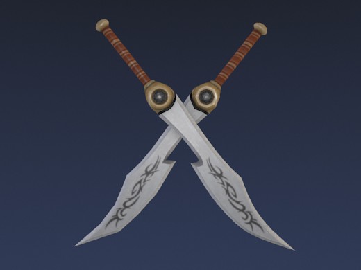
Above is a jpg (lossy, 18K) render with gradient/blend. Do you see the disturbing artifacts?
Above are animations between part of the two gradient background images at +0, +10 and +20 contrast to make it easier to spot the difference.
The lossy jpg version has artifacts.
These are ugly and disturbing which can lead to the viewer disliking the viewed image. They might be hard to see on some screens but in many cases they will be subtley noticed. Note that "subtle" is especially dangerous, since the viewer does not know the reason for the discomfort while viewing the render and is likely to interpret it as not liking the 3D model.
Using png files for previews is not a solution, as their file size is about ten times larger than jpg files.
By not using a gradient (Blend Sky in Blender) in the background, the artifacts can be avoided.
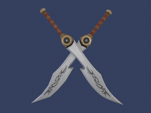
Above is a png (lossless, 156K) render without gradient/blend in the background.
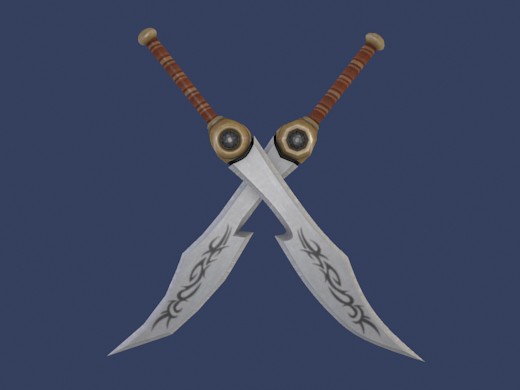
Above is a jpg (lossy, 16K) render without gradient/blend in the background.
Above are animations between part of the two no-gradient images at +0, +10 and +20 contrast to make it easier to spot the (lack of) difference.
Why does it help to not use a gradient? Because by reducing the complexity of the background, the amount of varying image data is reduced. This way the jpg compression algorithm has less image data to 'lose' while compressing the background of the image.
The image used in this post is a render of the "Tribal Long Sword" by Quandtum which you can use in your game under cc-by-sa, At time of writing, the model preview has a gradient in the background. This inspired me to write this hairsplitting, nitpicking post. :)
Did this post make you realize why you disliked some renders in the past? Or can't you see the artifacts at all? Do you happen to know of a gradient that does not create disturbing artifacts? Please let us know in the comments.


Comments
maybe you can appreciate this software:
http://caesium.sourceforge.net/download.html
Yes, there are artifacts in the gradient background, and gradient backgrounds are one of the things that show JPG artifacts most clearly. It is a good thing to be aware of when using more extreme compression levels.
But i don't think it is of practical importance, at that compression level. The point of the image is very obviously the swords. A gradient background isn't going to increase the artifacts on the swords, and normal viewers will be looking at the swords 99+% of their time with this image.
Oddly enough you have focused on a minor flaw, to the point that you missed a bigger flaw: contrast between the object and the background. The lossy gradient version is a better, more powerful image than the either of the flat background images-- since the background provides more contrast, and helps the swords to "pop".
Don't miss the forest for the trees.
Excellent writeup, I found it educational (animations helped!). I do understand how the could imply it's the model textures and not the render. eleazzaar also has a good point (and was my intent), but now that I see qubodup's point, I'm inclined to think that the pop can also be achieved by choosing a different backdrop color. What I found interesting too is looking at the one above without the gradient, it initially looked (visually) like a circular gradiant (eye can play tricks now that the light has subtly changed). All in all, good post, and good discussion.
Hmm, I actually see lots of artifacts in the one color background, and I don't think it's much better. For some reason I even see horizontal stripes in the image here on OGA, but not on Flickr.
That is less a reason to not to use gradients as previews but more to not to use pngs as previews.
And no, I see the artifacts in neither.
>That is less a reason to not to use gradients as previews but more to not to use pngs as previews.
>And no, I see the artifacts in neither.
I guess you wanted to say 'not to use jpgs as previews'.
But what i find more disturbing than the artifacts in the gradient are the artifacts around the swords, which you can see in both the gradient and the flat jpg image.
Actually, if the previews are gonna be lossy JPEGs anyway I would go with the gradiant background. The lack of artifacts in the one-coloured background draws the eyes to the even more obvious artifacts around the swords' edges and as eleazzaar has already pointed out: those artifacts are the main problem.
Of course, as Quandtum thinks, an object can be made to "pop" without a gradient background. It depends on the object weather well-chosen gradient is a good, bad, or indifferent way to make the object stand out nicely. Contrast is the key.
"These are ugly and disturbing which can lead to the viewer disliking the viewed image. They might be hard to see on some screens but in many cases they will be subtley noticed. Note that "subtle" is especially dangerous, since the viewer does not know the reason for the discomfort while viewing the render and is likely to interpret it as not liking the 3D model."
Obviously an image without artifacts will look better and more pleasing. But the vast majority of images on the internet are compresses to some degree. People are used to it as long as the compression is not excessive. Whenever you can, sure, it's will look better to use minimal compression. But minimizing artifacts in the least important part of an image (a detail-less background) while leaving them in the main part of the image accomplishes virtually nothing.
JPGs are not all equal. A JPG with the lowest compression will not have visible artifacts, even under magnification. So the problem to be alert for is the use of JPGs that have been compressed too much weather or not a gradient is involved.