HoaLW Soldier
HoaLW Soldier
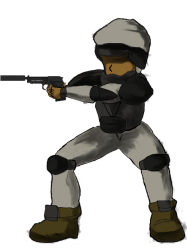
I have not been doing much this past month with regards to my game. I made progress, but not as much as I would like. Taking 5 computer science courses can be very time consuming. Anyways, I felt like making art today so I spend my entire Sunday making this one.
Before I continue babbling, go ahead and watch the making of the Soldier!
http://youtu.be/a9SKtGK8VSs
The video is running at 20x speed. It took me about 12 hours to make. I first drew it on paper (the easy part). I was going to record myself drawing it too but my camera is not very good.
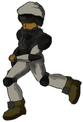
The zip file contains EVERYTHING (even my childish drawing) you need to make all the poses and animations you want by simply doing some rotations and simple layer management. I also included a template to make it easy for you to re-color. (Don't worry, there are no chicken scratches this time =)
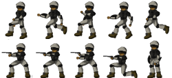
Note that the sheet that I cooked up is a rough one. However, you can make it smooth. Make a 30 fps sprite sheet just by doing some rotations and other beginner stuff. Animation is tedius work, which is something I'm not fond of doing.
You may criticize my work- but please no curse words =) This is only my second art. I will improve (hopefully someday to Redshrike's level)
Almost forgot, there is one thing that I used (the pistol) that isn't mine - http://opengameart.org/content/two-pistols


Comments
I think the sprite-to-rig approach works well if you have a way to use such a format. I helped kickstart the Spriter tool. You should look it up! Remember my first submission? That was totally meant to be used in a rig-based animation system.
Anyway, nice work. I like your workflow. You should consider getting Paint Tool Sai or Flash for making the lines, though. Illustrator also works well. Beyond that, there is Animation Studio and Pencil and a few other tweening/layering tools which will allow you to manage body parts fairly well. I still recommend Spriter, though.
<- Cries lol. If only I had known about such tools (or remembered they existed) this would have been a lot easier to create and probably would have looked a lot better.
Thanks for the tip Mr.Tap