Bart's art practice
Bart's art practice
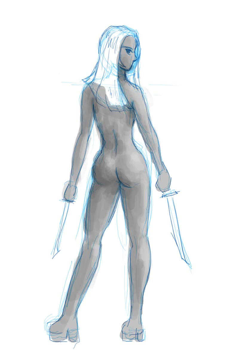
So Ceninan and I agreed the other day that we were going to do some back and forth art practice and critique, so here's something I drew in 30 minutes or so:

The above image is based on this photo by Marcus Ranum. Bearing in mind that it's just a quick sketch, feel free to comment.
Bart


Looks really good already. I think the perspective on the legs is a bit off though.
You could rotate (anticlockwise) the pelvis in my opinion. Otherwise she seems to have one leg shorter than the other.
How sneaky of you not telling me you posted this :).
Bigger butt cheeks are needed. (Um, is that a bit blunt?)
http://forum.freegamedev.net/
Okay, once more with feeling. :)
I tried to take into account all the C&C I've gotten on this. In particularl, I've tried to make her pose a bit more dynamic, because it's pretty flat in the other. Note that pose and proportions are intended to be a bit exaggerated, but are intended to look correct in that context. Hover over the image to see the whole thing.
Much better but there is something wrong in her face, i think the nose is too low or too long.
Maybe you should move a bit the nose and eye to the right so they are aligned with the mouth.
The face on the first draw was better I think (though the eye is better on the second ^^)
last thing: the neck have to be in the middle of the trunk.
Here's another.
Reference: http://mjranum-stock.deviantart.com/art/This-Will-Only-Hurt-a-Lot-10-185...
I'm not totally satisfied with it, but the whole point of this exercise is to get critiques and opinions, so bring it on. :)
Bart
And another.
Pose ref: http://browse.deviantart.com/?qh=§ion=&q=tough+girl+cosplay#/d41f9iq
I've been trying unsuccessfully to exaggerate the poses up until now. I think this time I may have actually succedded.
Critiques?
Ref: http://i.imgur.com/Fmdiz.jpg
Here's another, with a somewhat tougher pose.
Ref: http://i.imgur.com/Vhrha.jpg
My best advice right now is to learn from life drawing books - you've got anime heads down sort of right, save for the eye positions not offset 'inside' enough but the anatomy in general is a bit blank. The biggest problem seems to be in the waist area IMO
Ugh. I'm not doing that well today. This is the best I could come up with after several false starts. I'm trying to work on the midsection.
Ref: http://markdaughn.deviantart.com/gallery/?catpath=/&offset=120#/d2e1kwr (NUDITY)
On paper this time. 1, 2, and 3 are the best, the rest are mostly junk.
I think you make some progress.
You should do some warm-up before drawing (5/10 minutes) : drawing staight lines, circles, curves, hatches, drawing with left hand, if possible on large sheets. It's very important if you want to have accurate lines.
Here I'm experimenting with the idea of drawing the skull as a sphere and the face as kind of an oval-shaped mask.
Taking the mask idea a bit further. The top drawing is kind of crappy, but the bottom one isn't too bad.
Unfortunately, in the case of the bottom one, I still needed to make adjustments to the shape of the chin, but I left the guidelines in to hopefully give me a better concept of the 3d shape of the "mask".
This one isn't all that great -- I fixed the eye in gimp, but at least this time I didn't have to redraw the chin after I drew the face, so that's something.
I think these are better.
I agree those are better
Careful on the second image in your last post. Look at where the neck connects with the head. Still, I think you're moving in a good trajectory here and the drawings are definitely improving.
Yeah, I realized that after I posted it. The spine is toward the back of the skull, so the neck should have been further back. That's what I get for just drawing it without thinking about it. :)