PieTextureset
PieTextureset
Sunday, June 20, 2010 - 23:43
Art Type:
License(s):
Collections:
Favorites:
43
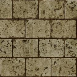
A few textures I did for practice.
3 Rusted metal tile textures
3 Stone tile wall/floor textures
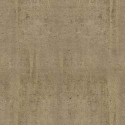
3 Concrete wall textures
These were made for use in Cube Engine 2 based games, tough they're just jpg's so you can use them in anything really.
512² resolution. Diffuse, normal, Parallax and Spec maps.
Look in the .cfg files for the 3 numbers at every texture if you want RGB values for specularity color.
*note: you can download this file from my server, as well as a high resolution version with 1024² PNG's
http://www.neuralrust.com/files/pie.tar.gz (1.8mb)
http://www.neuralrust.com/files/pie_hires.tar.gz (38mb)
Check out the comments for more history on these textures!
File(s):


Comments
Very nice stuff, Spiney, thanks for posting :) How did you make them, if I may ask?
I'll try to elaborate a bit :)
Sorry if this is too much info haha...
These are all photosourced. Basically I just went out and took pictures of walls and floors.
Bright overcast weather or shadowed places on a sunny day tend to work well.
If you have too much shadow and highlights in your source photo it tends to fight with the normal maps.
Next thing I did was load them up in Adobe Camera Raw and got rid of any perspective distortion and lens vignetting. If you have a zoomlens it's best to zoom in a bit, having a wide angle zoom tends to give fish eye distortion.
Some of them I used some skewing transformation afterwards in Photoshop.
I turned on the grid view to see if every tile has the right dimensions, that will make it easier to get them to tile seamless. On one of them I actually cut out each individual tile and re-assembled accordingly.
Using the 'offset' filter in PS you can put the outer edges in the middle and seams will become very obvious, then you just need to fix them with the clone stamp tool, or use some copy/past magic. I always try to look at elements that might show obvious repetition when it's tiled. This is generally undesirable so I try to work out most of them. If you go overboard with this tough you might ending up with a very generic looking texture - which in itself isn't necessarily a bad thing.
A cool trick I picked up for faking chipped paint is to use the flood fill tool (paintbucket) and have it 'sample all layers'. Then just make a new layer and click on parts where you want to have chipped paint. I did this on the white brick wall texture, which was actually the blue-tinted floor texture but with some adjustments. For the rest it's just a matter of making sure the colors of the different textures match up. There are plenty of color correction tools in photoshop so this isn't an issue mostly. You can also try to fix the white-balance at the beginning and slightly colorize the textures afterwards.
Most of the normal maps and some diffuse maps I did in a program called 'Crazybump'. Which works really well if you're working from photos.
I studied graphics design in highschool, so all the Adobe programs are very much ingrained in my work flow. I'm sure that these days there are plenty of competent open source alternatives tough, like Gimp, Inkscape, Blender, etc...
You definatly don't need those thousand dollar programs.
Some design related things I learned from these:
*Keep it simple. Too much grunge and random detail doesn't really make a texture better. Just add what it needs, don't add random layers of dirt.
*Hierarchy: start with the major shapes, let these have the largest value range. Then do the intermediate shapes with slightly less contrast, and detail should be additional. The hand painted textures in Team Fortress 2 are a great example of this. Very easy to read, and focus on the big picture - details are secondairy.
*The overall value and color of the texture defines it's appearance the most.
I think next time I'll try to start with just a set of flat colored textures and try them out in game to see how they work together. Then I'll try to design the patterns and shapes and base the normal maps and all the rest of that.
*Warm verus cold. This can mean saturated vs desaturated as well as warm vs cold hues. Rather then basing this on value it's more of a saturation and hue thing.
In Lab color mode you can easily control this by using the L value to keep the values consistent. On warm hues, less saturation = colder. On cold hues, less saturation = warmer.
*Keep the bump and spec maps simple.
I noticed that by focusing on the large shapes in the normal map it tends to make things look more volumetric and convincing in game. Since we're dealing with a finite resolution it makes sense to focus on the bulky shapes and leave out small cracks and pores. I don't think you should leave them out completely, but the major planes should be defined the most I think. Something similair with spec maps I think, tough those are considerably more forgiving.
*Use color in the specs.
Using white tends to make things look plastic, adding color makes them look more metallic. Some engines support color spec maps, it might be a good idea to leverage those. Also specular exponent makes a difference, but Cube doesn't support that as far as I know. In Doom3 and Quake4 people often critisized the game for looking plasicky. This was because it used a fixed specular exponent and most of the speculars were white or gray. The specular exponent is the falloff of the specularity, high values tend to give very bright and crisp, focused highlights, like you would see on a wet surface, or something that has been coated. Lower values tend to give a softer more spread out highlight, like on dull metal.
If an engine used colored spec maps, and a grayscale 'exponent' map it would be possible to have a wide variety of materials within the same texture. This would be usefull for models with UV maps.
Also having a normalmap for specularity alone can be usefull for certain things. Like flaky car paint or the kind of metal you see on highway streetlights or signage - where the surface itself is smooth but the speculars do change depending on your position.
( Just making note, incase any developers are reading this :D )
Awesome writeup Spiney, you should put that on a blog/wiki somewhere :)
Also, when you share content like this, it's a nice place to mention the project you are working on, as it shows people that project x shares content and raises interest in it
Nice read! You could use a blog :)
I uploaded the 1024 png pack and created a montage of all textures, for the preview to give a general overview rather than detail ;)
I hope you don't mind these changes
On the contrary, it's much better this way!
I wasn't sure about uploading the large one, since I know the site admin must pay for it's bandwith and all.
Thanks anyway :)
forwarding this too freegish project soon :)
Great texture pack, I can tell a lot of effort went into them. May I suggest that you add these textures to a cube or a sphere, or both, and use that as an example so people can see what they will look like shaded and actually in use with all the maps combined.