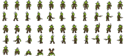
[LPC] Goblin
[LPC] Goblin
Thursday, June 26, 2014 - 13:11
Collaborators:
Art Type:
License(s):
Collections:
Favorites:
142
A goblin made in LPC style by Redshrike. More parts (shield, helmet, etc.) coming soon.
Copyright/Attribution Notice:
Attribute Stephen "Redshrike" Challener as graphic artist and William.Thompsonj as contributor. If reasonable link to this page or the OGA homepage.
File(s):


Comments
Instant Favorite : )
Thanks Mumu
A valuable contribtuion to the LPC!
Thank you zerohero. I believe in FOSS ideals, that's why I pay to have things made and give them away.
Thank you very much!
New goblin parts coming soon. Redshrike has been hard at work creating an amazing set of new accessories! Stay tuned for an update soon.
I think there is something wrong with the placement of the images on the sheet. (or I am doing something wrong). When I bring this into Unity and Split the sprites into a 64x64 grid, the goblins are offset in unpredictable ways.
Try it. Split into 64x64. Then flip through the sprites, you see the golblin 'slides' to the right. If I compensate for the slide on the first few images, the others are offset in different directions.
Ideas?
I have re-aligned the images in the goblin-with-sword sheet above (attached). This fixes a problem with the goblin "drifting" mentioned above. I've also flipped the order to rear-left-front-right to match the other LPC assets and moved the attack animation to its own rank (so each row only contains frames for one animation).
For anyone who wants to do something similar, here's what I did (after splitting to one animation per rank):
1. Cut the image up in vertical strip, one frame for each animation in each.
2. Place each strip in a new layer.
3. Pick an anchor point. I picked the base of the head for the rear-facing one (with one exception, as mentioned below), the belt-buckle for the front-facing and side-view, and the support foot for the stabbing animation.
4. For each frame, align the anchor point across different layers. For the rear-facing one, I used the base of the feet instead of the head for a few frames, to preserve the bob of the head.
5. Convert the different layers to a sprite sheet (there's a GIMP plugin for that).
EDIT: I just realised that this guy actually appears taller than the LPC base sprites, which looks a bit off...
Hi,
Just wanted to say thank you for these brilliant images. I'm using them in my new game, "Goblin Harvest - The Mighty Quest". The game's (nearly) in Early Access / beta and can be played at goblinharvest.com (browser-based HTML5 version - needs a reasonable internet connection and doesn't work at all on iPhone or iPad).
I plan to realease the game for iPad (proper iOS version) and Windows. More info at the Offical Web Site and Game Wiki.
I think you'll agree that your Goblins look brilliant as they march down the map!
Thanks again,
Ian
Sweet, happy to see this goblin sprite getting used.
Things have moved on a bit since I posted. I've had all of the graphics overhauled by an artist, so the game is now much less "8-bit". I still really liked the goblins, though, so I asked the artist to make higher-res versions. I think you'll like how they turned out.
You get a mention, of course, on the "About" screen of the game.
I used your goblin in a top-down Link to the Past type game. I just uploaded an update to itch.io. If you would like to check it out here is the link: https://dansena.itch.io/cronicles-of-liberia-the-legend-of-sara