a little pixel art editor
a little pixel art editor
Hello
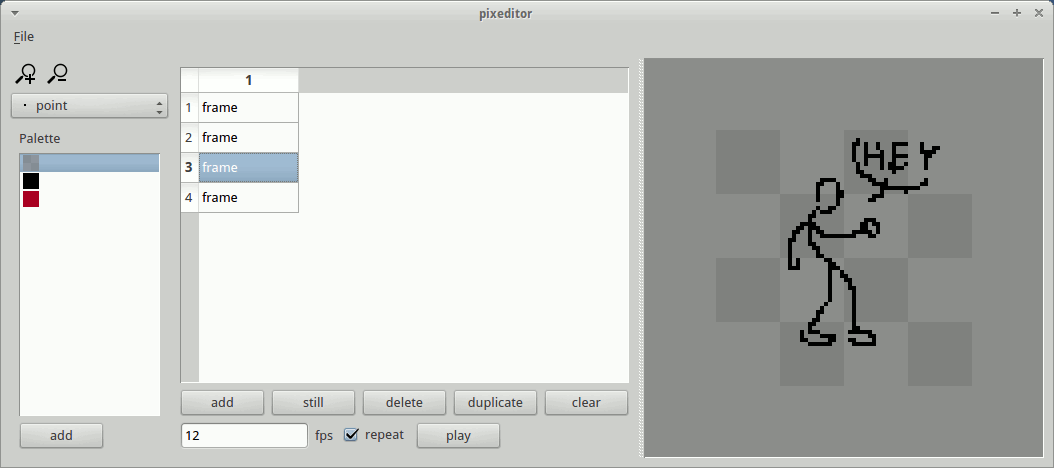
I want to present you a little graphic editor to make animated pixel art I have made last months.
This is an very alpha version but it became usable.
It is directed toward animation so for now there are not a lot of function with color, brush, everything else (just the minimum)
Here is the source, https://github.com/pops/pixeditor ( you will need python 2.7, PyQt, and Qt to run it)
I didn't test it outside of ubuntu (return are welcome).
Use the left and right key to move to previous and next frame.
ctrl z and ctrl y to undo, redo, it work only with painting action.
I post it now to have some return, you are of course welcome to extend it, or to help me to found a real name.

Have fun!


I tried it on windows and it work fine, to install:
First install python 2.7; for 32 bit : www.python.org/ftp/python/2.7.3/python-2.7.3.msi
or for 64 bit : www.python.org/ftp/python/2.7.3/python-2.7.3.amd64.msi
Then install pyqt, 32 bit : http://sourceforge.net/projects/pyqt/files/PyQt4/PyQt-4.9.6/PyQt-Py2.7-x...
or 64 bit : http://sourceforge.net/projects/pyqt/files/PyQt4/PyQt-4.9.6/PyQt-Py2.7-x...
then download the program : https://github.com/pops/pixeditor/archive/master.zip
and run pixeditor.py
On Linux just search Pyqt on the package manager, and install the version for python 2.7
then download the program : https://github.com/pops/pixeditor/archive/master.zip
make pixeditor.py executable and run it.
On macos, I didnt test, but it should work by installing python 2.7 an pyqt (the version for python 2.7) and run pixeditor.py
Just wanted to say I like the idea of a good animation package for sprites! I'd try to coax a few sentences about what our resident spriters want in an editor, unless you have a lot of experience yourself.
While the installation was painless for me, you might want to provide a video and/or more pictures to allow people to get a better grasp of the application without downloading :)
(Here's a quick reminder how to check if you're using 32bit or 64bit Windows:)
Hello ceninan, thank for your feedback.
I have a list of basic feature that i want to implement but i'd like to hear what your spriter want :
# add more control on palette
# add pipette
# add fill
# add a tool to make lines (iso...)
# add resize canvas
# add move frame content
# add icones with update on mouserelese
# add copy paste move frame
# add onionskin
# add layers
# add choice between a gif or png transparency mode
# add a cursor layer (pixel who will be paint) grid
# add animated gif export
About a video I intend to make it later but you should be right, I rarely install some obscur alpha program found on the internet :)
I'd love to see something like this get quite powerful in the future. It could save a lot of headaches for the pixel artist crowd.
The big feature I'd want is the resize canvas; I always start too small or large.
Very good work!
This is the kind of tool I'd dreamed to write to complete my own animation toolchain : http://devnewton.bci.im/projects/nanim/index
Maybe I can write a patch or a plugin to add nanim files support?
I created a patched version with nanim save support:
http://devnewton.bci.im/tmp/pixeditor/
pennomi: I have begin to add the resize canvas function :)
devnewton: nice work, there is still a bug with still frame (because they are just False and you need to take the previous real frame):
def save_nanim(self, url):
nanim = nanim_pb2.Nanim()
animation = nanim.animations.add()
animation.name = "default"
i = 0
for im in self.centralWidget.framesWidget.get_all_canvas(True):
if not im:
im = exim
exim = im
nimage = nanim.images.add()
nimage.width = im.width()
nimage.height = im.height()
nimage.format = nanim_pb2.RGBA_8888
nimage.name = "img_%d" % i
i = i + 1
pixels = bytearray()
for y in xrange(im.height()):
for x in xrange(im.width()):
colors = QtGui.QColor(im.pixel(x,y))
pixels.append(colors.red())
pixels.append(colors.green())
pixels.append(colors.blue())
pixels.append(colors.alpha())
nimage.pixels = str(pixels)
frame = animation.frames.add()
frame.imageName = nimage.name
frame.duration = 100
frame.u1 = 0
frame.v1 = 0
frame.u2 = 1
frame.v2 = 1
f = open(url, "wb")
f.write(nanim.SerializeToString())
f.close()
I will add it as a plugin I think because of the protobuff dependance
Oh and a screenshot of the new interface...
Thank you, I will follow the evolution of your project!
Note: do not hesitate to add a screenshot to your github page, it make it more interesting.
Looks promising, but still a way to go :)
Keep us updated!
Thanks, here are some news
I have added :
https://github.com/pops/pixeditor
Somes news:
I have changed the file format for some xml thing (you can still open old files)
and I have begin to work on a new timeline with layers and copy/paste
What are those rectangle in the timeline?
they grey rectangles represent the frame duration and you can stretch them with the little white square.
Hello
I finally merge all my recent modification:
https://github.com/pops/pixeditor
Looks pretty cool. :)
I haven't tried it yet as I'm not at home, but the timeline (with frames subordinate to layers) looks very nice. This could be the first pixel editor with (in my opinion) proper animation editing.
Now with a full set of pixel editing tools and palette editing tools it could be the mythical holy trinity of pixel editing.
EDIT:
Tried it and, yes, this is the way an animation interface should be. Very nice.
Red warrior needs caffeine badly.
Thanks, this is the reason I start this project
NIce thing! I'm not good at pixel art, but in my opnion that tool could be very useful for animating. THat looks clear and understandable!
I like the windows's scheme. WHat kind of visual theme are you using? is it inclued in your program?
Hello Eiyeron, the window's theme I'm using is greybird and no it's not included with the app.
I wanted to make something for the brains challenge but miss some feature, so I've add it:
Now I will try to finish my half zombie looking for brain...
I see you're adding onion skin, with that and GIF loading/saving this could already be very usable for EasyToon-style animation.
Does PIL properly support animated GIF read and write (a quick web search isn't terribly conclusive)? If so I might have a look at adding GIF support over the weekend (no promises though as I've yet never touched Python).
Red warrior needs caffeine badly.
I've just commit about onionskin, it's basic (only the previous and next frame without adjustment) but it work.
About Gif, I think I postpone this for some times, so if you want to try
PyQt can read Gif (don't know which version) but no write
PIL can read Gif but only write an old version ( http://www.somethinkodd.com/oddthinking/2005/12/06/python-imaging-librar... this is old but as old as the last version of PIL)
But there is this in the comment http://code.google.com/p/visvis/source/browse/vvmovie/images2gif.py (with PIL and Numpy)
(I'm not very enthousiastic with adding too much dependancy, but it seems to be the only way)
You're right about PIL only writing 87a. You can output multiple image block images, but they aren't true animated GIF.
So, being the fool I am I started writing a GIF reader/writer from the spec, we'll see how that goes (probablly not well).
Red warrior needs caffeine badly.
I've improved pixeditor's Python 3 compatibility and created a pull request.
surt: so how that goes? :)
CruzR: I've just merge it, thank
with that, i've added:
Hello
I just discover that png have indexed color (and that Qt support it)
So I have added a basic import function. It work only with png with indexed color but you can import them as sequence.
@pops:
Actually, the PNGs don't even need to be indexed; Qt can index RGB images for you. The only drawback is that the resulting color table will always contain 256 colors, even if your image uses less. I've got a prototype for such an importer lying around, and I'll post it once I'm at home.
EDIT:
I've implemented importing non-indexed PNG files and created a pull request.
I like that you have a palette tool, but it would be nice if each color box took up about 25% less space. (Very slight change, just think it would look better.) I also think the right-click should be used for erasing so you don't have to change tools. Not sure yet what else could be done outside of improvements you are probably already aware of, like more tools, resizing the canvas, etc.
The app is really cool. I would probably use it in the near future if I make any pixel art. it looks fun.
Syrsly
Twitch Streamer, Web/Game Developer, & Artist
syrsly.com - contact me for commissions, thanks!
very cool Cruzr
Now i need to find a way to limit the palete, and select it...
Tap: the palette need to be reworked (it can only display 128 color), I will see how it look with less space.
I like the idea with right clic, the problem is that the first color can be change, not sure how to make it clear. Maybe just add the possibility to select a second color with right clic.
I have finished the new undo/redo, now it work everywhere... :)
Hello
There are lot of news since the last time:
I will make a 1.0 release soon but before I'd like to add some resources (pen, texture, background, color table) There are some in the resources folder but its just the basic so if you have good one...
the new screenshot:
Could you explain how the layers work? What are all those boxes?
Syrsly
Twitch Streamer, Web/Game Developer, & Artist
syrsly.com - contact me for commissions, thanks!
yup,
on the left, you have layers name and the black or white box next to them is the visibility.
on the right, you've got time who go to the right, each grey box is a different canvas, so little box duration is one frame, and large box have a longer duration.
with the little white square inside them you can strech the grey box to expand the duration
it's hard to explain in english, I hope you understand ^^
I'll make a video one day...
Hello
Some news:
- ressources (palette, pen and brush) are now simple files, you can import or export them
- alpha is not part of the palette anymore and you can erase with right clic
- less bug :)
Well screenshot are automatically updated but...
What's the reasoning behind having a seperate widget for transparency?
I see in the code that the transparency is just a palette index (as it should be) so why seperate it from the palette like that?
I've been messing about with your code some here. Mainly just ruining your carefully laid out GUI to dump everything into docks so far. :P
Red warrior needs caffeine badly.
For the transparency, there was some action that imply transparency was color 0 (merge layer, selection, move, erase), the separate widget just make it clear that you can't change it but you still can select it if you have no right clic (tablet).
There a try to make dock in the code : just comment line 461 to 468 and uncoment line below 470 to 478.I was not really convinced...
I just try your fork, I better understand your question now.
I like the lock layout option and the qsetting (just discover it) but I dont understand the idea of makink so much dock. you will always need tool, context, palette and option and they dont take so much place in screen. the timeline could be useless sometime...
(there is an annoying thing with dock that are outside the windows; they stay in place when you switch virtual desk.)
My philosophy when it comes to GUIs is that if the user might reasonably want to configure their interface a certain way and the cost of letting them do so isn't oppressive then one should make efforts to do so.
For example: I personally hate having any floats at all but it costs nothing to allow them and disturbingly many people seem to prefer them so why not.
Give the drawing context panel a current colour swatch with a pop out palette colour selector (I plan to implement this) and one could hide all other docks and work quite effectively with minimal screen clutter.
Red warrior needs caffeine badly.
Ok so why not merge the tool option and drawing option as they appear only depending of the tool.
Another things about the toolbar and tool menu: IMO the default toolbar is not a great idea as it take a lot of vertical space, there is allready the timeline who take vertical space.
And the tool menu wont be really used, shortcuts is a better option if you want to hide the tool dock.
btw some shotcuts idea : https://github.com/z-uo/pixeditor/wiki/Shortcuts-idea
I agree about the toolbar not being great, much less flexible positioning in Qt than with docks and always uses full width/height.
I just wanted to use actions and an exclusive action group for the tools and toolbuttons in a dock wasn't working for me as I expected. But I think is was just that I hadn't set the actions to checkable, so should work in a dock.
Menus are nice for self documentation: show all the possible actions and shortcuts for those actions. An option for a popup menu (launched from a button or as context menu) instead of menubar would be nice to reclaim a bit more screen space.
Working on drag-and-drop palette editing in the vein of GraphicsGale ATM.
Red warrior needs caffeine badly.
I merged your change about dock, make a lot of change: I've merge the option and context dock and keep the palette for now...
For the shortcuts, I 'he put them into tooltips.
Hi !
I've just tried it today, it's awesome ! both simple and powerful, good job !
Cool. I'd be very selective about what you pull from my fork as I've broken at least as much as I've added. :P
I've got palette drag-and-drop mostly working nicely: LMB drag to swap colours, Shift-LMB to replace colours, Ctrl-LMB to move colours, Ctrl-Shift-LMB to insert new colours. Canvas doesn't update properly when using these yet though and there's a strange bug where the drag-and-drop stops working most of the time when the palette is undocked.
I've also added colour slider docks for non-modal colour editing, though they are a bit funky due to error propagation in the RGB/other-colourspace conversion, and replaced the custom colour selection dialog with the Qt standard one, the custom one wasn't working properly for me.
About the transparency, I've thought that what would be nice, rather than having one global palette index as transparency, have a configurable index per layer which renders transparent during compositionas well as a configurable global index that is used as transparent in the fully composed image when exporting. This is basically how GraphicsGale does it and doesn't force an extra palette index which can mess up palette layout. I've added the extra entry to the pix file handling, though yet to actually implement any of the funtionality.
Also reworked the new project dialog to have a preset size combo.
Red warrior needs caffeine badly.
Yup I see you broke lot of thing, I like the drag and drop palette and the color slider but I will wait to integrate them. For the color slider, I think rgb is useless, only computer can understand it.
About the custom color selection, what the problem? did you change something?
And about the transparency, I dont understand, there are different palette for different layer? It seem really confusing.
I really think this is the best option ; first it's simple, qt colortable can have more than 256 color so it's not a problem to add it, palette file doesnt have alpha so it need to be added somewhere and all imported images are processed so it's simple to add it.
The only problem may be that it's not in the palette (btw I've added a shortcut to switch alpha/color > E) and to export 256 color gif (but it is resolved with a dialog to choose a background)
Is anyone currently developing this (or a fork of it)? It's a pretty nice tool for pixel art and animation already, but it would be cool to see further development.
Edit: Just checked the repo and it looks like it's still in active development.
I never use it, and I'm not fond of the QT library, but if you want to start a new project in C++, I need a project to learn SDL2 with. :)
Syrsly
Twitch Streamer, Web/Game Developer, & Artist
syrsly.com - contact me for commissions, thanks!
With 1 commit to correct a bug in 4 month, I would not say the development is active.
For now, I don't have time/interest/... to make bigger development than correct bug when I found them. Sorry
Surt make nice change too, but neither he or I spend time to really integrate them.
If someone whant to continue this, I'll be glad to help him.
My fork is more broken then not, so I wouldn't recommend working from that.
Being morally offended by the broken design of Qt's Graphics View, I started work on an editor (probably for the dozenth time) built around GPU based rendering and image manipulation but that's far from anywhere near usable and I haven't touched it in months.
Red warrior needs caffeine badly.
the latest version with the time line looks similar to this program called pencil animation. its free opensource for win mac and linux in c++
screenshot
http://www.pencil-animation.org/contents/Screenshots/0.4.3-screenshot-wi...
homepage
http://www.pencil-animation.org/