Perspective Walls Template
Perspective Walls Template
Friday, June 18, 2010 - 16:47
Art Type:
License(s):
Favorites:
30
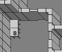
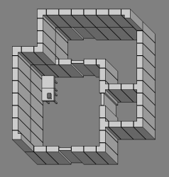
Many old games (notably Ultima VII) used this ortho 45 degree perspective; it's fairly easy to create pixel art in this style. Here is a template for making graphics in this style.
The base tile size is 32x32, while the entire tile is 64x64. Walls are 16 pixels thick, doors are 8 pixels thick. A table and book are also provided for reference.
If your map needs layers, the walls line up to stack on top of each other.
See the preview below done with Tiled and this tileset.
File(s):


Comments
wow, nice. Like it, plain and clean. :)
I got inspired by this tileset to experiment with a slightly different perspective. I love the Ultima VII perspective, but it can look very warped sometimes. I attempted to make it a little less skewed by using a 2:1px diagonal instead of a 1:1px diagonal .I haven't actually seen this used in a game before (although it no doubt has been) so I wanted to see what it would look like. I think it is an improvement towards a closer approximation of human perspective. I don't know what exactly this would be called, perhaps it is a variation of trimetric? The Ultima VII perspective is an oblique projection with halved depth commonly called cabinet projection.
The downside of this perspective is it creates unequal sides for bottom and right (perhaps why it isn't used very often in games) and so you would end up having to create 4 angles for a symmetical object instead of just 2 with the Ultima VII way. It also requires a 16x16 grid to line everything up correctly instead of a 32x32 and at least with tiled this means you can't just "paint walls" you have to place each one. It also may not be as immersive, but I think it is at least somewhat less distorted looking, and might experiment with it further. It also has the benefit of not as much horizontal wall hiding of objects.
Quite awesome :) i love that kind of perspective. But it's really really hard to paint walls in tiled with it. I need 3 layers and it takes a long time to paint everything correct because you have to switch constantly between those layers. Also collision detection isn't that easy with this perspektive but I'll give it a try :)...
This is really great and I plan on using them after I apply some textures to them. But what about angled or curved walls? This is a great framework but cuved and angled walls would help add some varity to cubed buildings. Know what I mean?
Anyways, this looks great. Great work with it so far! :)
Wow! Excatly what I have been looking for! Thanks for sharing.
Hi! I know this was posted forever ago, but I was wondering if you had any insight on how to create tiles like these in Blender? I have been trying to get the camera angle correct and I can't seem to get it right.
@TylerJessilynn
As far as I know this exact view isn't possible through a regular Perspective or Orthographic 3D camera.
If I needed to achieve this look through Blender output, I would try making the scene or the walls themselves Skewed into a parallelogram shape instead of a rectangle shape. Then an orthographic camera from the top could give this general look.