First Person Dungeon Crawl Art Pack
First Person Dungeon Crawl Art Pack
Wednesday, May 1, 2013 - 11:50
Art Type:
License(s):
Collections:
Favorites:
131
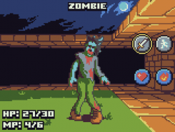
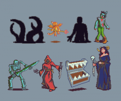
This pack contains the entire set of art used in my game Heroine Dusk.
- Set of interior and exterior tiles
- Set of enemies (not animated, just stills for turn-based combat)
- Set of interface pieces
- Set of paper doll heroine with weapons/armors
The technical specs:
- The full view is 160x120 pixels, meant to scale up to needed size using blocky pixel scaling (nearest neighbor).
- The entire pack uses DawnBringer's 16 color palette.
- Each tile has 13 visible positions in a rough cone shape.
- Each tile is 160x120 or 80x120, slotted into 640x240 pixel tile sheets
Some of the tiles were created by using Blender to create reference renders. I've also attached those files.
Attribution Instructions:
Include my name "Clint Bellanger" along with your credits. You may optionally provide a link back to Heroine Dusk (http://heroinedusk.com) or my personal site (http://clintbellanger.net).
File(s):


Comments
Cool, interesting game Clint and nice job on the enemies. I especially like the druid. I can easily take the concept resize it down to 64x64 and polish the pixels and have more enemies for the game I'm working on 'Dusk'. I'm very happy to say that Dusk is currently being hosted online. If anyone is interested in playing an old GMUD game check out my blog http://duskrpg.blogspot.com/ All that's needed to play is Java.
raaaah druid, second time he kill me.
Very nice art and game, I find the view/move weird at first but it's definitely cool.
do you plan to add a save?
pops, saving is done with cookies. If you have cookies enabled you should be able to close your browser/tab and open it again to resume. Death is currently permament though.
I love the mood of this art. Also, game plays on my phone. fun!
This is one of the coolest things ever.
Love the clean, flat-shaded style.
I've always wanted to try one of these, but the technicalities are somewhat offputting/appealing. Did you use 3D models as a guide for construction or construct the tiles manually?
@surt
I used 3D models as guides for many of the tiles. Once I figured out how many tiles I wanted visible, I played with the camera position and focal length until some test cube tiles were giving me a good perspective and fit into the view nicely. After settling on basic positioning (no science here, just what felt good), I used those same settings to prepare all the tiles.
Then I'd make primitive 3D tiles and render them. Import the renders into GIMP, then in a new layer trace over the outline and general shape. Add a bit of shading and that's about it. For simple tiles the workflow is actually not bad -- assuming you already can do basic blendering.
If you see the attached grid.blend you can see the reference models I created.
awesome pixel art
Very enjoyable, very addictive.
Minor comment: The way the Mimics respawn feels a bit odd. In particular it allows for an exploit as follows: Go to a Mimic, kill it, step back, step forth, kill it again, and so on until it is time to refill MP. Works well to milk XP^Wgold. Is that intended? Otherwise I suggest to defer the respawn until the map is reentered.
@caeles It's fine to milk gold there. I had one mimic closer to a rest point that I removed because it was a bit too easy to farm, but the ones currently in the game are okay. There's some risk fighting them until OOM and trekking back to a safe area.
I was able to play a lot longer this time since I first tried it. Its really easy to get lost it would be really great if the map was on the main screen and not by the character sheet. Its really hard to get a sense of where you are even with the compass help. I lasted longer once i found the heal spellbook and also figured out you could rest in the hay. The druid killed me fast. he ate all my mana then scorched me or something. The only thing that kinda stinks was everything to buy was always so expensive. it kinda sucks going into 5 shops and still not having enough money to buy anything. The game was a lot larger then I originally thought.
Used this for a one-weekend coding challenge:
http://alexmpronotebook.postach.io/tiny-rpg-and-its-sources
Thanks :D
I butchered both this and the Heroine Dusk code to make Ascension: Adventure. It also uses some other art from here and other sources, which I butchered. It's not very good, but it fits a gap in the series.
http://xcvgsystems.net/?page_id=144
I'm planning on porting it to Android (sort of- WebView with some Java calls in the code) and if I do so I will probably port Heroine Dusk as well.
Correct me if I am wrong,
Are these sprites available for Commercial Use becasue the license says yes but it seems to be in a Non-Commercial Art Collection.
I'm not totally clear on the nature of hilty's "Non-Commercial - Art" collection, but I don't think it is any indicator of what can or cannot be used in a commercial project. Pretty much everything in that collection could be used in a commercial project so long as the individual license terms are adhered to. (NONE of the license terms for the art in that collection have terms preventing commercial use.)
Non-commercial restrictions are not allowed on OpenGameArt. That category is a user-made one.
You can use this art in your game if your game (at least the art part) is also CC-BY-SA. In other words: if you're sharing the art of your commercial game, you can use the art I'm sharing too.
I made all this art and can relicense them under different terms. If you wanted to use this art in a closed project there would be a licensing fee.
Cool thanks
Another question that popped in my head what Game Engine or maker are you guys using or Are you making it from scratch (C++, Java etc) If you are doing from scratch could you guys point me in the right direction like a web link or something I'd appreciate it.
Hi! Just wanted to let you know I used these sprites in my game 'Instant Pixel Palette Scramble!' for the OGA Summer 2017 Game Jam.
https://itch.io/jam/opengame-art-game-jam
The look amazing to begin with but they actually worked almost perfectly with the game concept as they are large, clear and use only a few well differeniated colors, and yet at the same time, they make absolutely ingenious use of those colors. The result is that when the colors are scrambled up it's still clear what the image is supposed to be but it's not obvious where the colors should go and it's not until the final color is swapped into place that the image really clicks. Truly a masterful set, thanks for sharing!
This is exactly what I need for my prototype, thank you so much!
I made some coins/medallions based on the elemental spells/icons in Heroine Dusk. Released on my profile on OpenGameArt but I figured I'd share them here too. The coin shape is originally by 7Soul1
Nice work!